Embracing Logic: Tips to Organize Your Website’s Navigation

Many people don’t realize how important website organization is—that is, until they come across one that doesn’t make logical sense. The way your website is organized can make or break the overall user experience. If someone visits your site looking for specific information, but they get confused by the setup or get lost before finding what they need, there’s a good chance they’ll go elsewhere for an easier-to-use resource. Building a practical, user-friendly navigation is essential for creating an effective website.
Navigation refers to more than the layout of the menu bar. This term refers to the entire digital arrangement of information on a website—from text and anchor links to the sitemap and navigation bar (or dropdown menu). Building a dental or medical website that allows for effortless browsing requires more consideration than many people realize, though. And taking a haphazard approach can significantly hinder the growth of your website and its long-term success.
How to Organize Your Navigation
When it comes to creating a logical organization for your website, most individuals prefer a hierarchical structure for page navigation. What that means is all your content can be traced back to one primary page—your homepage. Your homepage should be designed to draw visitors in since it serves as the cornerstone of your architecture.
Flat Vs. Deep Site Structure
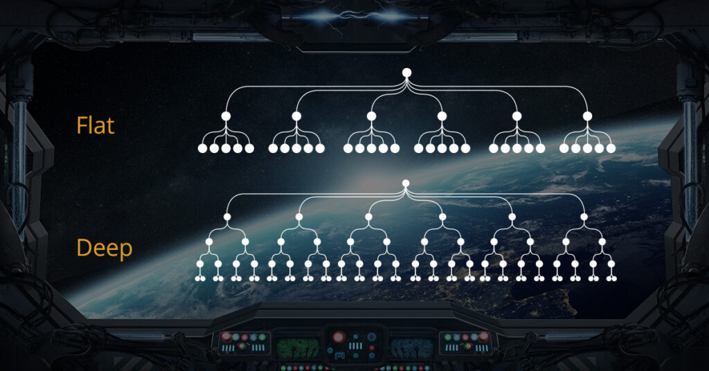
The homepage is the beginning, and with this first link, the chain is forged. From this point on, hierarchical structures come in two main types: flat and deep. Deep site hierarchy looks like a pyramid, or perhaps a Russian doll, with several layers of pages nested under other pages. The less complex and more inviting option is known as flat, or broad, site hierarchy. In this structure, you find significantly fewer “sublevels.” Visitors can choose between a greater number of main categories with fewer nested, or “child,” pages. Here is a visual comparison of the two structures:

There are multiple reasons to choose a flat structure. This simpler setup makes it easier for users to locate pages and faster for them to find relevant information. Plus, a flat hierarchy helps search engines understand your website better, since they can more easily identify the relationship between all of your pages.
Internal Link Structure
Another integral part of creating an organized website is your internal link structure. The strategy you use for link building not only helps patients find their way to additional resources, it also tells search engine crawlers which pages are important. Your primary goal should be optimizing links so search engines can readily identify which are the main pages. Every parent page should have visible, clickable links to its subpages, and the subpages should typically link back to the corresponding main page. This serves as a virtual map and also allows search engines to distinguish between important pages versus blogs with similar subjects.
“Fixing” Your Navigation
Now that you know a bit about the nuts and bolts of why an organized layout is so important, both for viewers and for search engines, let’s talk a bit about visibility, as well. In years past, standard navigation schemes on websites saw the navigation bar at the top almost immediately disappear once the viewer began to scroll down the page. This resulted in the navigation aspect of websites being a bit less user-friendly and a bit more time-consuming. Advances over the years have now made a “fixed navigation” (also referred to as “sticky nav”) the new standard. Fixed navigation essentially freezes the navigation bar (a.k.a. the entire table of contents for the website) in place no matter where the reader scrolls on the page. Now, all that work that’s been put into exceptional organization can be viewed at virtually all times while the viewer is on the website, giving them the chance to go wherever they want whenever they want. This ultimately enhances the user’s overall experience and provides them with an excellent tool to find more and more information on the site without having to spend too much time hunting it down.
Building a logical website structure with sensible navigation requires patience, forethought, and an understanding of human and search engine behavior. If you’re considering an update to your practice website, don’t forget that Rosemont Media is here to help! Our experienced consultants, designers, and developers can make sure visitors and search engines, alike, can easily navigate through your site’s structure for the optimal experience.
Editor’s note: The original version of this post was published on November 17, 2017.