Best Plastic Surgery Website Designs for 2025
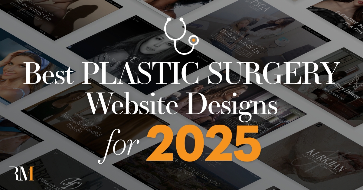
In 2025, it’s important to have a well-designed website equipped with user-friendly features that conveys your practice’s personality. A custom website design allows you to have more creative control over your site, from formatting and navigation to layout and color scheme — together, these components work together to extend your digital reach to a larger audience.
At Rosemont Media, we believe the best plastic surgery website designs give patients a peek into what they can expect from your practice while providing easy access to the information they’re seeking, all in a visually appealing way. We work alongside our clients to create a website they’re happy with and that we feel can help them stand out in the vast online space.
Our creative team genuinely understands the many complexities of today’s design and marketing landscapes. We pride ourselves on crafting strong, unique, educational, and SEO-optimized content on an impeccable graphic design scheme to reflect the true mission of your practice and the breadth of your services offered.
While there is no one-size-fits-all approach to creating a top plastic surgery site, we’ve highlighted some of our best plastic surgery website designs to inspire you!
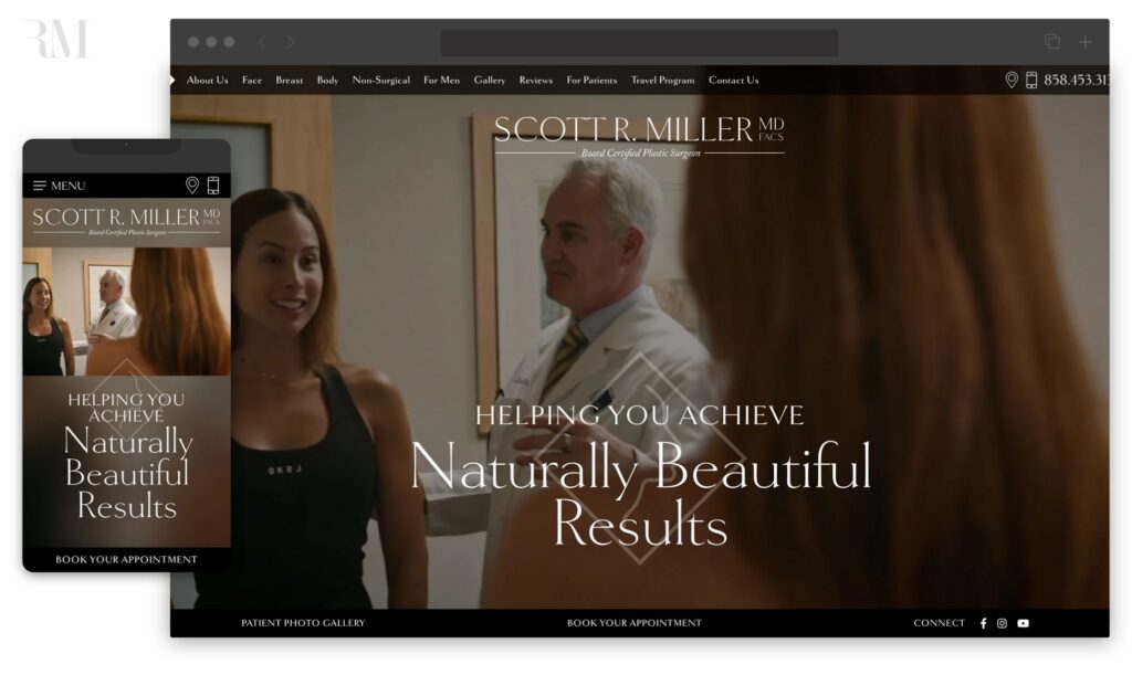
Miller Cosmetic Surgery
The website transformation of longtime client Scott Miller, MD, FACS is a seamless integration of intuitive navigation and modern, fully responsive website design. Upon entering the site, users are welcomed to a sleek video header showcasing the real consultation process while giving individuals an inside look into the patient-focused care they can expect at Dr. Miller’s office. Scrolling through the homepage, custom graphics beautifully emphasize the main tenets of Dr. Miller’s practice philosophy, which include principles of service, quality, integrity, and safety. Not only does the sophisticated layout, navigation, and color scheme accurately reflect the top-of-the-line atmosphere at Miller Cosmetic Surgery, but an expansive built-in patient gallery and strategic content — written to educate, as well as facilitate leads for the practice’s top pages — allow the site to truly stand out.
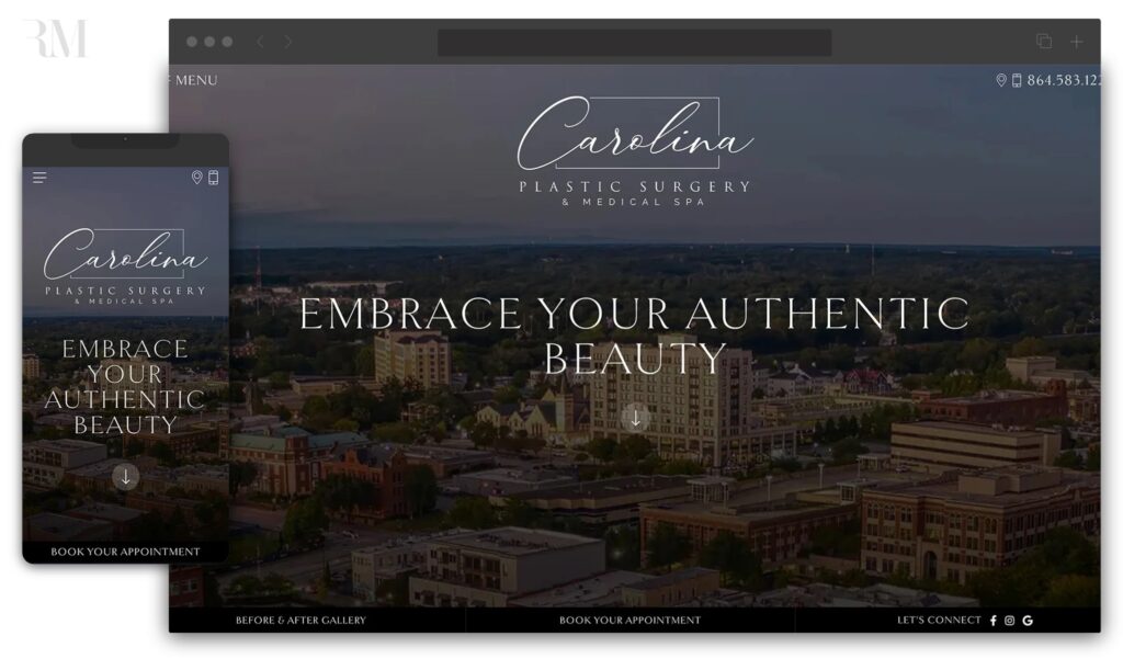
Carolina Plastic Surgery
After arriving at the newly-designed digital home for Carolina Plastic Surgery & Medical Spa, men and women seeking aesthetic enhancement are invited to an effortless online experience reflective of the warm, patient-centered philosophy encompassing the Spartanburg facility. Well-equipped with all the hallmarks of a first-rate medical website in 2025 — including a polished video header, SEO-driven content marketing, and custom-built sections spotlighting the doctors’ top procedures — the site is featured on a clean, responsive interface adaptable to any screen size. The many stand-out components of the website include a unique patient gallery offering the option to filter before-and-after photos by doctor, as well as by procedure. This is just one of several ways that the new site for Carolina Plastic Surgery simplifies an individual’s aesthetic journey while growing the practice’s patient base in the process.
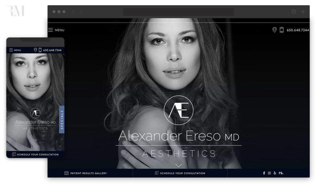
Alexander Ereso, MD
When Dr. Alexander Ereso took over the aesthetic practices of Dr. Samuel Pearl and Dr. Howard Rosenberg, he recognized the need to completely overhaul his brand identity and usher in a new era for his business. This modernization of his online presence is beautifully showcased in the new website for Alexander Ereso Aesthetics, which skillfully encompasses the sleek results, subtle beauty, and patient-centered care Dr. Ereso is known for. The website’s brand refresh highlights a new and exciting era for the practice without sacrificing the key elements of digital website marketing, including local and global SEO, informative yet engaging content marketing, and mobile-friendly design. The soft, muted color scheme also works to accentuate the beautiful outcomes showcased on the site’s before-and-after photos, giving users a clean and elegant online experience.
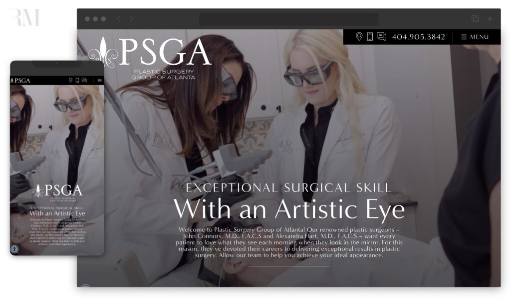
Plastic Surgery Group of Atlanta
When it comes to conveying a plastic surgeon’s high caliber of expertise and top-notch aesthetic outcomes, the website for Plastic Surgery Group of Atlanta is unrivaled. Several features work together to communicate the practice’s elevated standards of care, safety, and patient satisfaction, including a responsive and top-quality design, an intuitive interface, and an elegant video header providing a sneak peak into the inside of the luxurious facility.
Users can expect to peruse their favorite treatments more easily than ever with the site’s robust patient gallery, which can be filtered by doctor or procedure to effortlessly gain a sense of each surgeon’s work. Location-based SEO strategies are also woven into the site’s original content, placing Plastic Surgery Group of Atlanta in the very best position to be discovered by curious patients and major search engines alike.
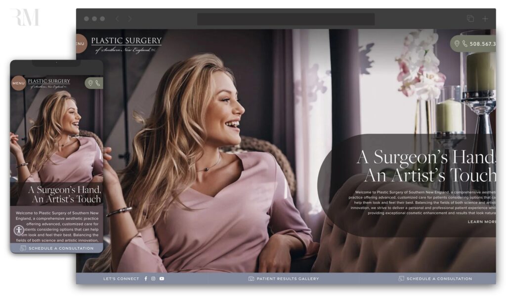
Plastic Surgery Group of Southern New England
Dr. Russell Babbitt’s vision for the revamp of his plastic surgery website was to create a welcoming and modernized encapsulation of his aesthetic services. With a soothing design, soft color scheme, mobile-friendly layout, and uniquely feminine touches tailored to Dr. Babbitt’s targeted demographic, the online home for Plastic Surgery Group of Southern New England conveys a pleasant environment where every patient feels like family.
Notable features on the site include user-friendly design elements, visually appealing anchor link menus, and a beautifully curated patient gallery showcasing real results from previous patients. These artistic touches combined with search engine-optimized content integration only reinforce Dr. Babbitt’s position as an authority in aesthetic services for the Southern New England market.
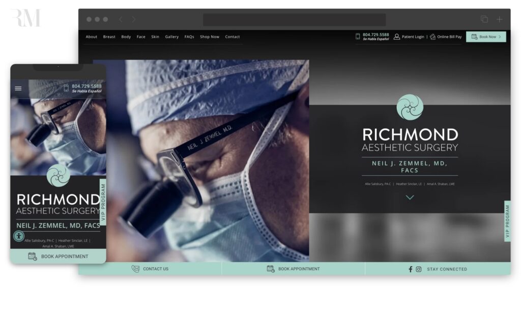
Dr. Neil Zemmel, MD
Dr. Neil Zemmel has worked with our Rosemont Media experts for many years on numerous websites that focus on different services available through his practice, including his medical spa website, his medical weight loss clinic site, a breast surgery site, and more. He trusted us again with the upgrade of his main plastic surgery website. In addition to a new layout and in-depth, original content, the site’s before-and-after photo gallery showcases transformative patient results, further illustrating Dr. Zemmel’s talent and expertise. Our efforts help improve the search engine rankings for this modern-looking site and reflect Dr. Zemmel’s commitment to helping patients remain informed on their chosen procedures.
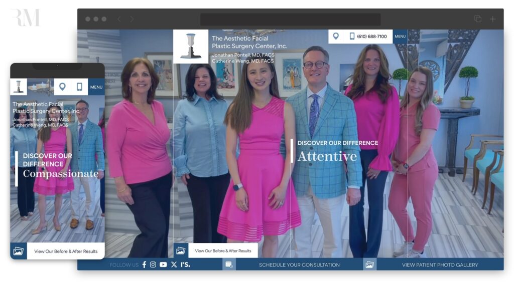
The Aesthetic Facial Plastic Surgery Center
Dr. Jonathan Pontell and Dr. Catherine Weng collaborated with our team to create a new website for The Aesthetic Facial Plastic Surgery Center, Inc. By incorporating different forms of media on the homepage, including a video introduction and high-quality photos, the website’s design is more dynamic and engaging. The custom-crafted content reiterates Dr. Pontell and Dr. Weng’s priorities of patient education, while the newly optimized SEO helps patients efficiently acquire the information they need. This new site beautifully blends content, design, and advanced technology to become an effective resource for prospective and current patients alike.
Plastic Surgery of the Carolinas
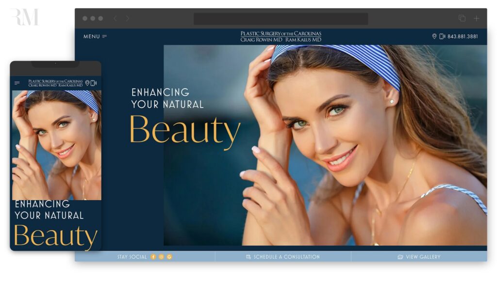
Dr. Craig Rowin at Plastic Surgery of the Carolinas came back to Rosemont Media to update his practice’s website to reflect the latest changes and advancements in digital marketing. This redesigned website features compatibility across a range of devices and a more user-friendly layout for easy navigation. The color scheme and clean lines exude professionalism and remain consistent with the branding on the practice’s medical spa website. Additionally, the SEO was updated to ensure the site could continue to be easily discovered by potential patients.
Dr. Rory Dower, MD
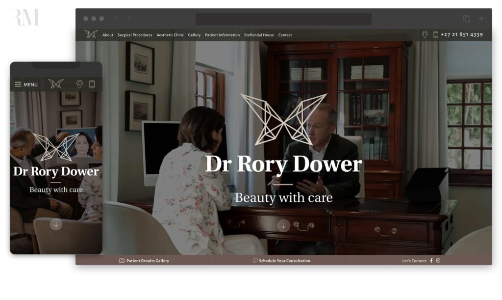
For the Cape Town practice of Dr. Rory Dower, our team strived to maintain the original style and feel of the website in the recent redesign while revamping it with additional helpful information and streamlined content. An extensive photo gallery with before-and-after images and patient testimonials were included to serve as useful resources for those considering plastic surgery procedures. The website content was also organized in a more focused way, featuring pages crafted with an eye toward giving viewers a fuller picture of the patient experience.
Farkas Plastic Surgery & Medspa
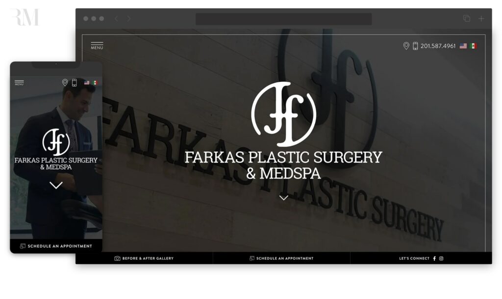
Looking for a website refresh, Dr. Jordan Farkas of Farkas Plastic Surgery & Medspa sought our team’s help to better reflect his practice’s philosophy and highlight his available services. Our updates included a clean design, responsive layout, and expertly placed calls-to-action. There is also a new and engaging custom video header on the homepage and detailed content about procedures throughout the site. Our team employed top plastic surgery SEO strategies to increase website visibility and reach a broader audience across a variety of platforms.
Contact Rosemont Media
Ready to get the ball rolling on your practice’s new website? Our team is happy to work alongside you and bring your digital vision to life. If you’re interested in learning more about our custom plastic surgery website designs, contact Rosemont Media today.
Editor’s note: The original versions of this post were published on 10/17/2023 and 2/4/2025.